What Are Dead Clicks in Microsoft Clarity? A Simple Guide
A plain-English guide to Microsoft Clarity dead clicks: what they mean in real life, how to find them, and how to turn them into website improvements.
A dead click is simple: someone clicks something on your website because they expect it to do something, but nothing happens.
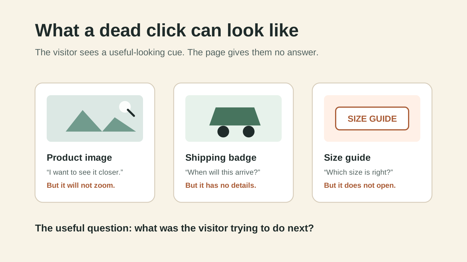
Maybe they click a product photo expecting it to zoom. Maybe they tap a size guide that looks like a link. Maybe they press a button and the page gives them no visible response. They clicked because the website made a promise. The website did not keep it.
Microsoft Clarity helps you spot these moments. It does not tell you that a sale was definitely lost. It tells you where a visitor expected an action and got no response, which is a useful place to look for website friction.
Topics in this guide
- What a dead click means in normal human language
- What visitors are usually trying to do
- How Clarity finds these clicks
- How to check whether the click is a real problem
- The most useful fixes to test first
- A simple weekly routine for finding opportunities
Dead clicks in real life
Imagine walking into a shop and seeing a sign that says “Ask us about sizes.” You walk to the counter, ask the question, and the staff member stares back without replying.
That is the website version of a dead click.
The visitor is not being difficult. They are following a cue your page gave them. A dead click usually means one of three things:
- Something looks clickable but is not. A styled heading, product image, icon, or label invites a click but has no action behind it.
- Something is broken. The button, link, menu, filter, or image gallery failed to respond.
- The response is too subtle. Something technically changed, but the visitor could not see it, so they clicked again or gave up.
The dead-click workflow
The job is not to fix every click Clarity shows you. The job is to understand what the visitor was trying to do, then decide whether the page should make that action easier.
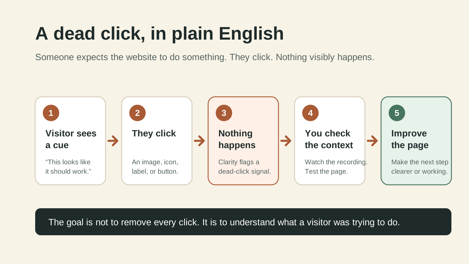
Step 1: A visitor expects something to happen
They click a product image, an icon, a size label, a delivery badge, a filter, or a button. Start by asking: what would a reasonable first-time visitor expect this element to do?
Step 2: The page does not visibly respond
Clarity records the click as a dead-click signal when it cannot see a clear response after the interaction. This is a prompt to investigate, not proof of a broken website.
Step 3: Watch the recording and check the page
Open the matching session recording. Look at what happened before and after the click. Did the person click again? Did they scroll away? Did they leave the page? Then test the same element yourself on desktop and mobile.
Step 4: Decide what the visitor needed
The useful question is not “How do I make this click disappear?” It is “What was this person trying to get done?”
If people click an image, they may want more detail. If they click a shipping badge, they may be looking for delivery timing. If they click a size label, they may need a size guide before they can buy.
Step 5: Make one clear improvement and check again
Add the missing link, repair the broken control, make the intended action obvious, or change the element so it no longer looks interactive. Then check Clarity again after enough visitors have used the page.
How to find dead clicks in Microsoft Clarity
In Clarity, open your project and look for the dead-click insight. Start with the pages closest to a decision: product pages, collection pages, cart, booking, lead form, and checkout steps.
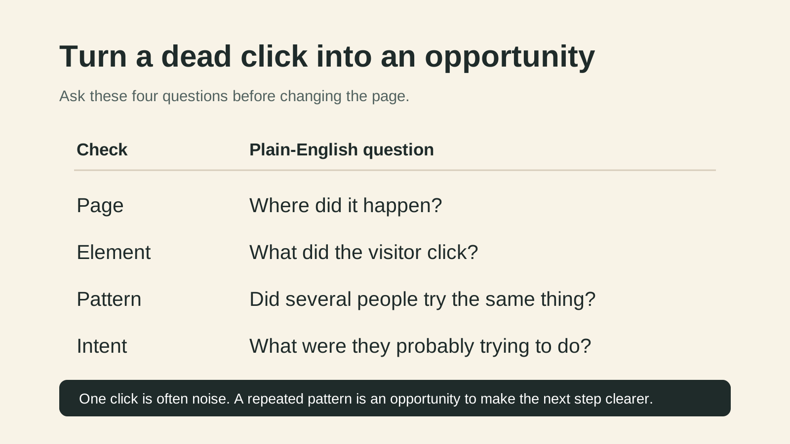
For each result, write down four things:
| Check | Plain-English question |
|---|---|
| Page | Where did it happen? |
| Element | What did the visitor click? |
| Pattern | Did several people try the same thing? |
| Intent | What were they probably trying to do? |
One click is often noise. A repeated pattern is an opportunity.
Common examples and what they may translate to
| What Clarity shows | What it may mean in real life | A sensible first test |
|---|---|---|
| People click the product image | They want to inspect the product more closely | Add image zoom or make gallery controls clearer |
| People click a shipping icon | They want delivery details before committing | Link it to short, clear shipping information |
| People click a size label | They need confidence before choosing a variant | Put the size guide next to the selector |
| People click a disabled-looking button | They do not understand why they cannot continue | Explain the missing step or improve the button state |
| People repeatedly click a filter | The filter may be slow, broken, or unclear | Test it on mobile and make the active state visible |
Do not treat this table as a diagnosis. Use it to form a sensible hypothesis, then verify it with the recording and the page itself.
When a dead click is not worth fixing
Not every dead click needs a project. Someone may click an image out of curiosity, tap while scrolling, or click an element that is deliberately static.
Prioritise a dead click when it is repeated, happens near a conversion step, and makes sense from the visitor’s point of view. A dead click on a product page’s size guide is usually more important than one on a decorative footer image.
A 15-minute weekly routine
- Look at the top dead-click pages in Clarity.
- Pick one repeated pattern near an important decision.
- Watch three to five relevant recordings.
- Write one sentence about what the visitor was trying to do.
- Make or queue one small improvement.
- Recheck after the page has received enough new visits.
Want the checklist beside you while you do this? Get the free Clarity teardown kit, a one-page guide to the Clarity signals worth checking.
This turns Clarity into a practical opportunity finder. You are not chasing a dashboard score. You are paying attention to places where real people were trying to move forward and the website got in their way.
For the wider weekly routine, read Your Analytics Already Show Where You Are Losing Sales. For the practical checklist, get the free Clarity teardown kit. If you want help identifying the clearest customer friction on your own store, request a free store review.

Tired of generic SEO fluff when searching for store fixes?
Google Search is packed with affiliate articles by people who never ran a store. Tell Google to prioritize real e-commerce field notes, working code, and honest math whenever you search.